Changing Your Clothes

Shopping, Sewing, Upcycling, Repairing: Make the most of your clothes!


6 Comments

If At First You Don’t Succeed… Dye, Dye Again

I’ve written several posts already about dyeing clothes, and more recently, about dyeing yarn. Now I want to focus on a process that has become increasingly intriguing to me: overdyeing!

What, you ask, is this overdyeing of which I speak? It’s simply dyeing something that has already been dyed. Yep, that’s it. So if you’ve dyed your blue jeans (or not so much blue as dirty-wash ones like mine, below), you’ve done an overdye job! Today’s post will focus mainly on overdyeing yarn, but all the basic concepts apply equally to garments.*

he Really Big Dramatic Reveal

Remember this?

Here’s a rundown of my process:

1. Ask yourself: Do I love the color it already is? If no, and if it’s not a dark color already, it’s an overdye candidate. (If yes, put that garment on right now and enjoy it!)

Tip: It may sound incredibly obvious, but the lighter your garment’s original color is, the more options you have, color-wise, for overdyeing. If it’s a dark color, any overdyeing you do will have a more subtle result; this can be really amazing, e.g. overdyeing navy blue with black, but still subtle.

2. Ask yourself: What color do I want it to be?

Tip: So far, in my dyeing experience, I’d say you’ll get the most predictable results by dyeing your garment in a darker shade of its original color. Example: The pale pink jacket I’m getting ready to overdye* is going to become (I hope) an ombré of deep red to medium-deep pink—staying in the same color family as the original hue.

3. Make an educated guess about the dye color you’ll need in order to achieve this new color.

Tip: You’ll have to take the original color into account, because it will blend with your dye color to create a unique new hue (unless your garment starts out white, in which case, technically, you’re dyeing, not overdyeing). For example, if you start with a pale blue shirt, and you want it to be a deep plum color, adding dark red dye to the blue shirt may get better results than purple dye. (For some color theory basics, see this post.)

4. Gather your materials: garment, test garment or fabric swatches, dye.

Tip: Other items needed for dyeing will be listed on your dye package, and will vary according to the fiber content of the fabric you’re dyeing; vinegar, for example, is generally needed when dyeing wool.

Another tip: There are a lot of factors to take into account, such as the fiber content, that can (and most likely will) affect your results. Ideally, you’d experiment with fabric swatches, but this is not always possible; an alternative would be to pick up a thrift-shop garment in the same fiber and color as your overdye-candidate garment, and use the inexpensive version to test your color theory. This part of the process has the added advantage of familiarizing yourself with the dye process itself, which gives you confidence to move on to dyeing your original garment.

5. Dye!

Tip: Again, très obvious: you really do need to follow the dye instructions very carefully, especially regarding safety. The Rit dye company has some useful tutorials here, and they also have a PDF with over 500 color recipes here!

How about some examples of overdyeing yarn? Yes, let’s do that. In my short but colorful history with dyeing yarn, I’ve had some amazing successes, but also some experiences ranging from “meh, I’m just not crazy about the color” to epic failures (one of these is coming soon to a blog post near you). Thankfully, unless you’ve dyed your yarn black, it’s almost always possible to give your ugly yarn a new life! To wit:

My very first overdye experience was with this merino/cashmere blend. The minty-green is not bad, it just looked a bit… flat.

Mint yarn before overdyeing

Mint yarn before overdyeing. On the right is the yarn after it was completely dry, showing how much lighter results can be than when the yarn is in the dye bath. (I had used the yogurt container to rinse measuring spoons, my gloves, etc., so the color of this water was constantly changing. For some reason, I thought I’d see what would happen if I dunked some yarn in it. Et voilà.)

Here, I dipped the mint yarn into a fairly diluted deep purple, hoping for something close to lavender.

After the lavender dip.

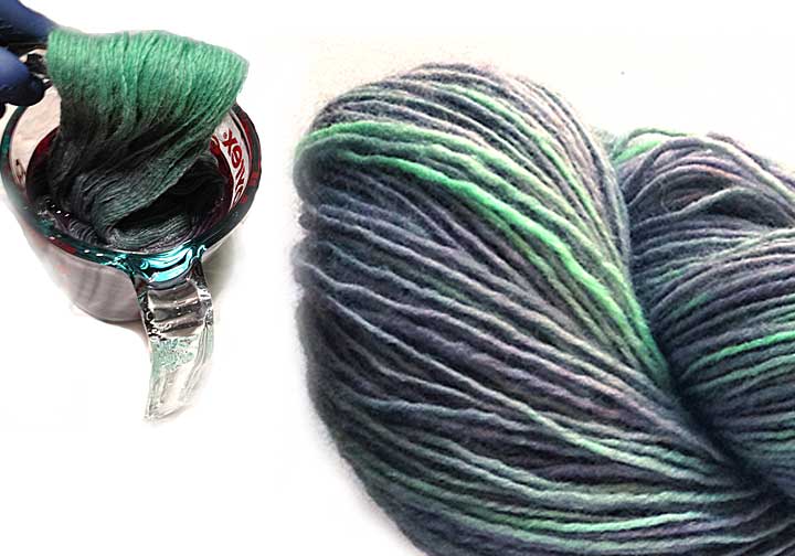
After the lavender dip. At left, I’m dipping most of the mint skein in the purple dye, using a clear paintbrush to hold the top of the skein; I deliberately kept this little part of the skein out of the dye, which resulted in the brighter minty spots in the finished skein (right).

Tip: This project gave me my first inkling of the transparent nature of dyes; if you look really closely at the finished overdyed skein (above, at right), you can see a little of the original mint green peeking through the lavender, giving the skein an overall watercolor-y character that I love. P.S. If you want all the sexy details about this particular skein (and my other yarns), they’re here in my Etsy shop.

Finally, a very recent example: the Emerald skeins I was dyeing for this month’s Birthstone Collection yarns. This was interesting. I dyed a skein of mohair/wool/nylon at the same time as a skein of 100% nylon ribbon (nylon and animal fibers both use the same kind of dye), and got quite different results, as shown in these swatches:

Emerald swatches.

Emerald swatches. The nylon ribbon (left) took the dye as I had hoped, but the mohair blend (right) looks like solid green, with a few turquoise-y spots. What’s a dyer to do?

Fortunately, the mohair skein was large enough to divide into 3 good-sized skeins. So I took 2 of these incredibly green skeins and overdyed each in a separate bath, hoping to achieve an ombré color sequence between the 3 skeins (I decided to leave 1 skein as it was after the first go-round). Here’s the result:

Ombré Emerald mohair set

Ombré Emerald mohair set of skeins. Skein 1 is the color from the original dye process; Skein 2 was overdyed with turquoise and sapphire blues, and Skein 3 resulted from the addition of a deeper blue and a little black. Success! (You can find this yarn in my Etsy shop here, and the ribbon yarn is here.)

Again, most garments that you dye will actually be overdyed (unless they start out white), so even though my examples focus mainly on overdyeing yarn, the same general process still applies to dyeing clothes. Once you get over your normal, basic fear of permanently ruining whatever you’re dyeing, I think you’ll really enjoy the process of changing your clothes with overdyeing— and the one-of-a-kind results!

* I have a pale pink cotton eyelet trench coat that I’ve had for years, but which needs a facelift (is that face lift?), so that’s next on my overdyeing project/post list. Okay, that might be after I dye some more yarn. Stay tuned!


4 Comments

Color, Theoretically Speaking

Yes, folks, as promised, here’s a fun little color theory crash course, cleverly disguised as a book review of sorts. What book, you ask? Why, it’s “Color”, by Betty Edwards (the acclaimed author of “The New Drawing on the Right Side of the Brain”). Okay, this seems like a pretty generic title for such a massive subject, so it’s subtitled “A Course in Mastering the Art of Mixing Colors”. Yes. That’s so much better.

Color by Betty Edwards

“Color” by Betty Edwards. Yes, the subtitle suggests that this book is geared towards art students, but stay with me— it does connect to your clothes! Click on the picture to see this book on Amazon.com

To back up for just a minute, last month, I started hand-dyeing and painting yarns for the first time, which I started writing about in this recent post (lots more to come on that in future posts). And a funny thing happened almost immediately: I realized how little I actually know about color! Sure, I’ve been producing a line of color-sequencing yarns* based on my own color concepts for over 10 years, and focusing on color-palette creation more recently, but when it came to actually mixing dyes in an attempt to create unique colors, it took me maybe 5 minutes to figure out that I needed more information. That’s when I found this book.

“Color” is written primarily for artists, yes, so most of the exercises are relative to painting. However, there is so much information about color itself that I found the book not only incredibly helpful in terms of basic color theory, but that it also greatly increases my awareness of, and appreciation for, the use of color in actual artwork. But for purposes of this post, I’m focusing on the color theory. I hope you’ll find it as beneficial as I have!

I did promise this would be a crash course, not a treatise, so I’ll make this as brief as possible, starting with a classic color wheel:

Color wheel

Color wheel. Isn’t it pretty? Courtesy of Northlite.net. Click the wheel to see it on their website.

You’re most likely already familiar with the color concepts presented on the wheel: Primary, Secondary, and Tertiary colors. Personally, I thought I had a handle on this, but some specific details gave me new insights. For example, I was aware that each secondary color (green, orange, violet) is a combination of 2 of the 3 primary colors (red, blue, yellow), but I didn’t know that the tertiary colors  (the hyphenated ones) are each a combination of a primary and a secondary color. And for dye-mixing purposes, believe me, this is quite a revelation, as you’ll see.

Tip: When I was just looking around for a good color wheel image, I was startled (and somewhat confused) by the enormous range of wheel styles. My advice is to stick with the basic 12-color wheel; it’s really all you need.

Now that we’ve absorbed the color wheel concepts, let’s move on to the 3 main attributes of a given color: hue, value, and intensity.

Just for fun, let’s use Pantone’s 2014 Color of the Year, Radiant Orchid, as our example:

Radiant Orchid

Radiant Orchid. Can you name its hue, value, and intensity? (I couldn’t, before reading Betty’s book.) Click on the picture to find this fab flash drive at Pantone.

  1. Hue refers to the color family your color belongs to; to determine this, find the color on the wheel that you think is closest to Radiant Orchid. I’m thinking Red-Violet.
  2. Value refers to the relative lightness or darkness of a color: white is at one end of this scale, black at the other. Radiant Orchid looks like it’s slightly on the medium-dark side.
  3. Intensity (also known as saturation or brightness) refers to a scale that goes from bright to dull. A fluorescent color, for example, would definitely be at the bright end, while a smoky shade would be closer to the dull end. Our Radiant Orchid looks like it belongs on the brighter (but not brightest) end.

Tip: If you have worked in Photoshop or another photo-editing application, you’re probably familiar with the term “desaturation”; if an image is completely desaturated, there’s no color at all— it’s greyscale. So you can think of colors on the dull end of the intensity scale as having grey added to them, replacing color. In dyeing, as with mixing paints, adding a bit of the complementary color—the one exactly opposite on the color wheel—also dulls the intensity, but without changing the original hue.

So Radiant Orchid can also be described as medium-dark, medium-bright red-violet. Ta-dah!

Okay. I realize this is still just theory. How does it apply to my dyeing projects? Well, since I’m determined to mix my own colors from primary dye colors (as opposed to using pre-mixed “fashion” colors), this is of tremendous help to me in planning which primaries to mix together. For Radiant Orchid, I’ll no doubt have to experiment to get an exact match, but I’d say that starting with red and blue, with a higher proportion of red (to make the hue red-violet), in a solution that’s not very diluted (so the value stays medium-dark), and possibly with a touch of yellow-green (red-violet’s complement) to slightly dull the intensity.

And what about dyeing your clothes? Well, assuming you’re starting with something other than a pure white garment, technically what you’ll be doing is over-dyeing, that is, adding color to an existing color, as I did with my jeans in one of my early dyeing projects on CYC. So if you’re starting with light-blue denim, which is already on the dull side of the intensity scale, you may want to dye it with a bright shade, which will take on some of the qualities of the original denim color (fiber dyes are essentially transparent); if you used, for instance, a bright shade of green dye, your results will most likely be an interesting blue-green hybrid, but your jeans will probably not be as bright as the dye color itself.

Honestly, now that I’ve learned about color hue, value, and intensity, I feel so much better prepared for my dyeing experiments; instead of just throwing colors together and waiting to see what happens, I have a solid basis with which to predict the results. This (I assume) will not only save me time (less experimenting), but also money, for the dyes and the undyed yarns I’m starting with.

I’ll leave you with this liberating thought: you don’t have to ever dye anything to apply these basic color theory principles to your wardrobe! Simply going into your closet and really looking at the colors that have collected there will give you new insights into the colors you prefer. Dark, light, bright, smoky, neutral, happy? Try to think of words that sum up your colors— then remember them when you’re shopping, dyeing, or otherwise changing your clothes.

*You can find my color-sequencing yarns in the Scraplet Skeins section of my Knittique Etsy shop. (Be sure to look at the color cards to see the entire color sequences in each skein.) And while you’re there, take a look my first hand-painted skeins, in the New! Hand-painted Yarns section.


7 Comments

Makeover Monday: Special Bonus Feature!

Previously on Makeover Monday:

We followed a pair of my jeans as they underwent intensive treatments at the Changing Your Clothes day spa: not one, but two dye baths, plus trimming their flared legs down to a straighter silhouette.

And now, I present the last in this 4-part Makeover Monday series, a Special Bonus Feature: A Change at the Top!

During last week’s Makeover Monday episode, while my jeans were lolling in their black dye bath, frankly, I got bored. Fascinating as the dyeing process can be, the prospect of 45 minutes standing in front of my kitchen sink, stirring constantly (I’m quoting the instructions) lost its appeal about 13 minutes in. I stuck with it manfully until the 35-minute mark, and then I just couldn’t take it any more.

Since I had begun to suspect that the stirring mandate was to counteract the fabric’s natural tendency to float, I had a sudden inspiration: if I found something else to throw into the dye on top of the jeans, it might help to keep the jeans under the surface, and presumably increasing the dye they were absorbing. I decided to risk a couple of minutes with no stirring, and dashed around looking for something suitable to dye.

Aha! I found this white top with clear sequins, definitely one of those what-was-I-thinking wardrobe moments (I almost never wear white):

White sequinned top before dyeing

White sequinned top before dyeing. Yes, it’s wrinkled— it was at the bottom of a bag of things destined for the thrift shop when I rescued it. Note how hard it is to see the sequins.

Continue reading