
My closet is just full of surprises.
There are the fun surprises, like finding that shocking-pink cashmere V-neck I’d thought I’d accidentally thrown away during a houseguests-are-coming organizational frenzy. Then there are some less pleasant surprises, such as a broken zipper on the skirt that would have been the perfect thing to wear out dancing or the jeans that don’t quite fit any more. And every once in a while, something simply serendipitous (not to mention alliterative!) takes you by surprise, usually when you think you have things all planned out, but then the plan changes…
The other day, I went to the library in search of books about dyeing (please note the crucial letter e in that word). Specifically, I was looking for useful information about dyeing yarns with acid dyes (I touched on my adventures in Dye-land recently). I’m working on a book proposal on this topic, so I naturally wanted to see what’s already out there. Since I had already done extensive online searching, including scans of library databases, I wasn’t totally surprised at the meager results: less than a dozen books grouped in the dyeing category, and almost all of them focused on (a) dyeing fabric, primarily cotton fabrics for quilting (which requires a different type of dye), and/or (b) using natural dyes. (Of course, it could be that books that would meet my criteria were all checked out, but I checked on the library computer before I left, and this was not the case.)
However, it’s virtually impossible for me to leave any library empty-handed, so I looked around the color/art section and found…
…this!

The Color Scheme Bible, my latest library find. (Image courtesy of Amazon.com; click the picture to see this book at Amazon.com.)
Yes, I know it says it’s about interior design, but if you look, you’ll find that most color palette-oriented materials available do seem to be for interiors. But that doesn’t mean you can’t put them to use in your closet! In fact, the following experiment may just inspire you to try new color combinations with the clothes and accessories you already have, not to mention the way you choose new items to add to your current wardrobe. Try it!
Here’s what I did.
Step 1. I skimmed through the pages of palettes (organized into sections by color families: pink, grey, blue, etc.), settling on this one that jumped out at me:

Step 1: Pick-a-Palette! I chose this one primarily because I know I already have several things in my closet in the main color (bordeaux, although they’re calling it damson berry). I love the general idea of wearing several different shades of red together, so this seemed like a good place to start.
Tip: Make sure your palette has a minimum of 3 colors: main color, secondary color (often a contrast to the main color), accent color. A simple, high-contrast wardrobe example would be a black skirt (main color), white blouse (secondary color), hot pink heels (accent color). If your palette has more than 3 colors, like the one shown here, you’ll have that many more options, particularly with your accessory colors.
Step 2: Start with something in your main color. I found this skirt. (This should be a garment, not an accessory.)
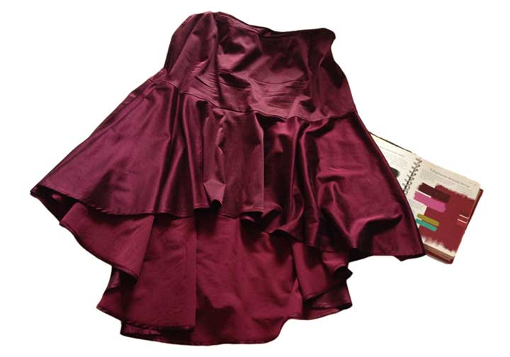
Step 2: Main-color garment: Bordeaux skirt.
Tip: When laying out your garments, it helps to put them on top of a white sheet so you can judge the color effects without distractions. (This is especially helpful when I’m laying things out on my bed— it’s covered with a deep claret-red comforter.)
Step 3: Add a secondary-color piece. An ensemble is not made with a skirt alone, so I pulled this be-sequinned espresso-brown tank:

Step 3: Top that skirt! This is the closest match I could find to the darker secondary color (top left on the book page), which they’re calling “eggplant”. This deep brown looks pretty close to me.
Already I have an outfit of pieces that I hadn’t previously thought to combine!
Step 4: Add another secondary-color piece. I wanted to find something in bright pink (the other secondary color in my palette), if possible:

Step 4: Add pink! Hand-knitted capelet, combining bordeaux shades with both light and bright pinks. Also note the difference made by adding multiple new textures to this outfit. Layering also makes it more versatile.
Notice how with each additional step, I’m actually creating a new look? And all based around the same skirt, and all done with things I already have!
Step 5: Add accent colors. I’m so intrigued with the sort of deep chartreuse and bright turquoise accent colors in my palette, neither of which I would have thought of pairing with bordeaux. I’m not so sure I have anything in those exact shades, but this sweater comes kind of close to the chartreuse:

Step 5: Acc-ent-uate the palette! With the addition of the chartreuse cashmere pullover, this outfit suddenly feels totally different. Okay, I’m not sure this particular sweater works wonderfully with the style of the skirt, but the point is to start to visualize new color combinations, right?
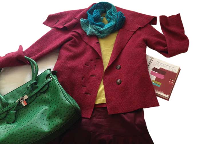
Step 6: Add another accent color, this time with accessories, that is, if I can find anything in my closet that’s reasonably close to turquoise. How about this green bag? It’s kind of in the same color family. I think. Ooh, and this turquoise scarf!

Step 6: Adding accessories. The scarf comes closer than the bag to the palette’s accent colors, but this exercise is not really about rigorously matching colors; it’s just about playing with colors. (The scarf is one I hand-knitted with some luscious merino/cashmere yarn that I dyed to create this ombré effect; the scarf is made with just 1 skein. Here’s where you can find this yarn in my Etsy shop.)
Step 7: Add finishing touches. I’m going to put a favorite sweater-jacket in a deep rose-red over this outfit and see what happens!
Step 7: Finish with a jacket! To my eye, at least, this ensemble suddenly looks much more cohesive. Again, the color of my jacket doesn’t exactly match anything in the palette, but it works. And the felted wool adds another textural surprise!
Tip: Looking at this last photo makes me realize that it’s a great example of the use of complementary colors, in this case, red and green (and various shades thereof). Remember my color theory crash course? Complementary colors are opposite each other on the color wheel—the origin of many a fine color palette.
Step 7, Part Deux: Try a different accessory color. Just by switching the turquoise scarf for one in shades of pink and red (also one of my own hand-painted yarns), this look changes yet again. And this time, the red/green complementary color thing is even more apparent:
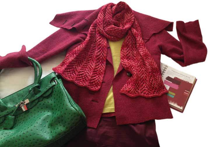
Step 7, Part Deux: The Big Scarf Switch! Changing to this subtly-variegated scarf makes a crucial difference with all these solid colors. And for me, considering all the different textures I now have in the outfit, this combination works the best, color-wise; it’s just shades of red and shades of green. Simple!
Looking at these photos again now, it really still amazes me that I could, in a matter of minutes (less if I hadn’t been taking these photos!), pull together an interesting outfit in a color combination I hadn’t thought to try before now. Quelle surprise, indeed!
Find a color palette that speaks to you, then take it into your closet. I’m betting you’ll be surprised by what you find!
I’d love to know what happens when you try this! If you want to get started right now (you know you do), browse palettes on ColourLovers. The link will take you to my page there, but you can search through the whole site; for example, when I searched for “bordeaux”, these are the palettes that came up.
